Creating a Chart View
This guide will walk you through the steps to create a Chart view, helping you visualize your data in a clear and graphical format with various chart types.
Step 1
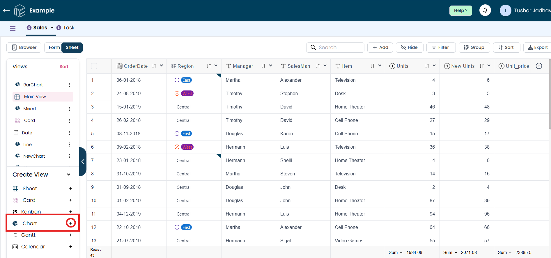
Click the plus icon to begin creating a new Chart view.
Step 2
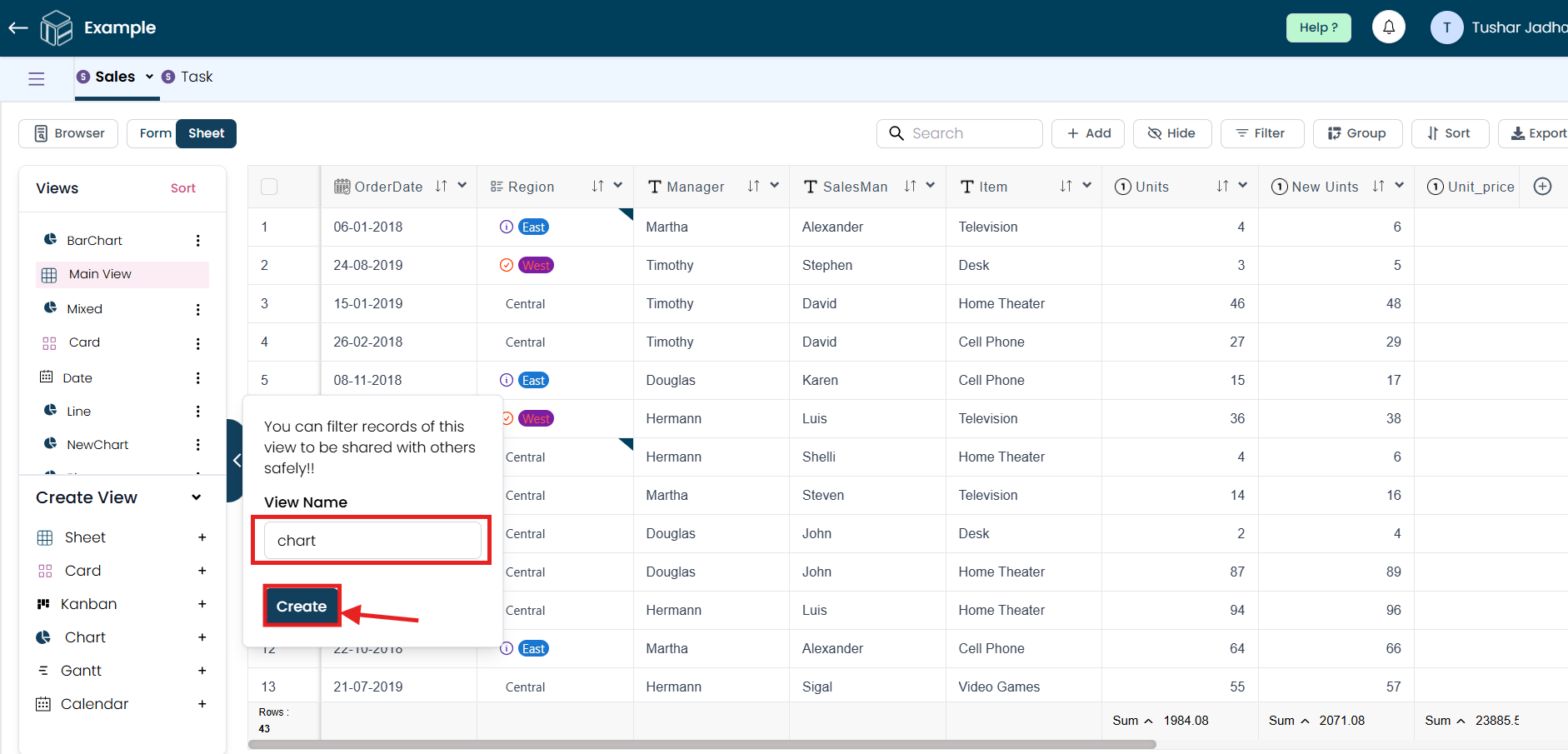
When the pop-up window appears, enter a name for your Chart view and click the "Create" button.
Step 3
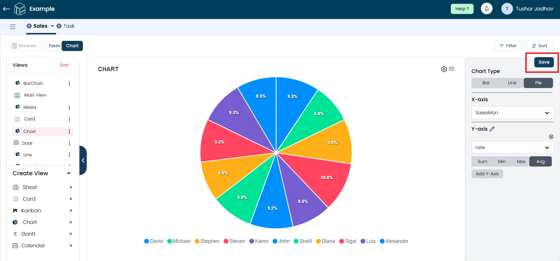
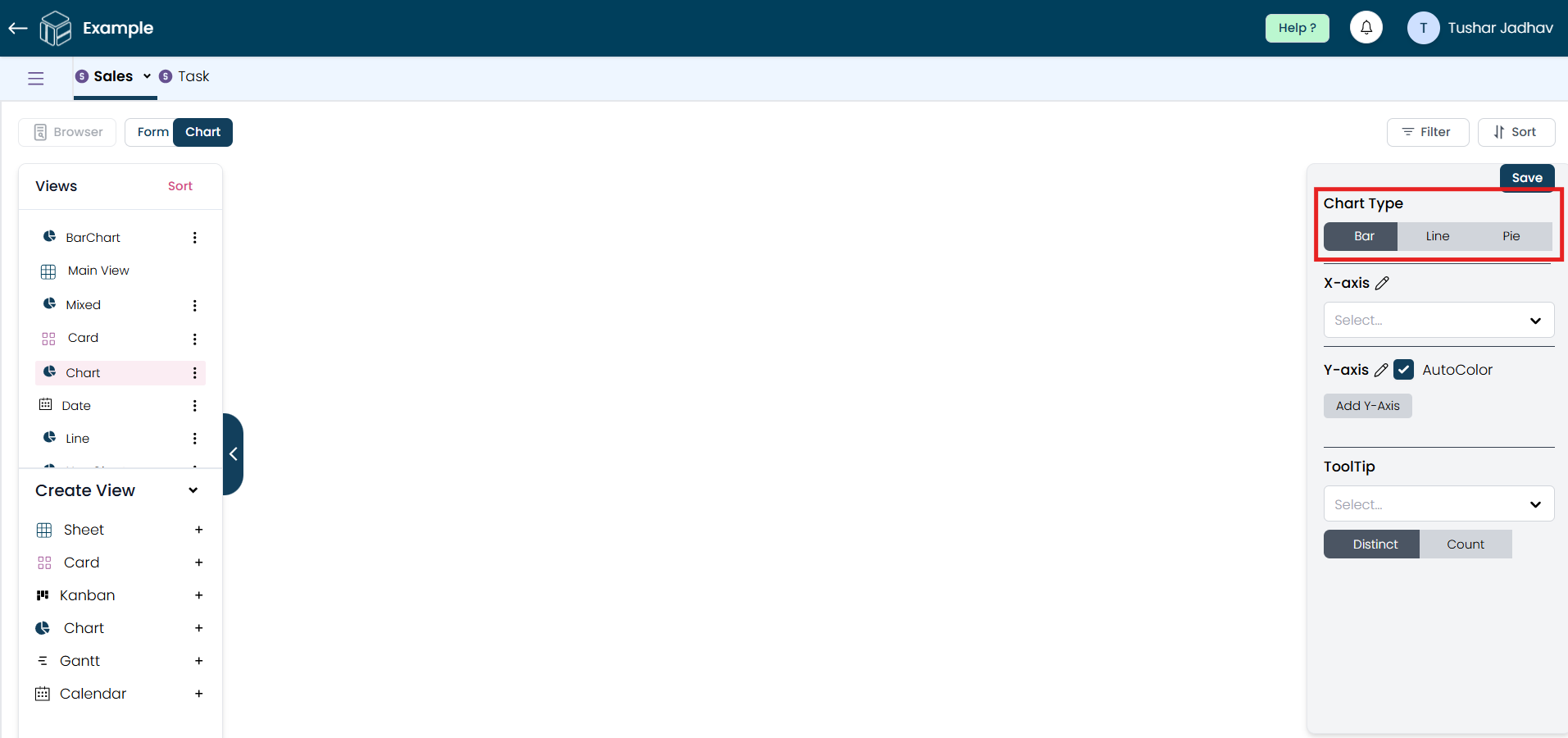
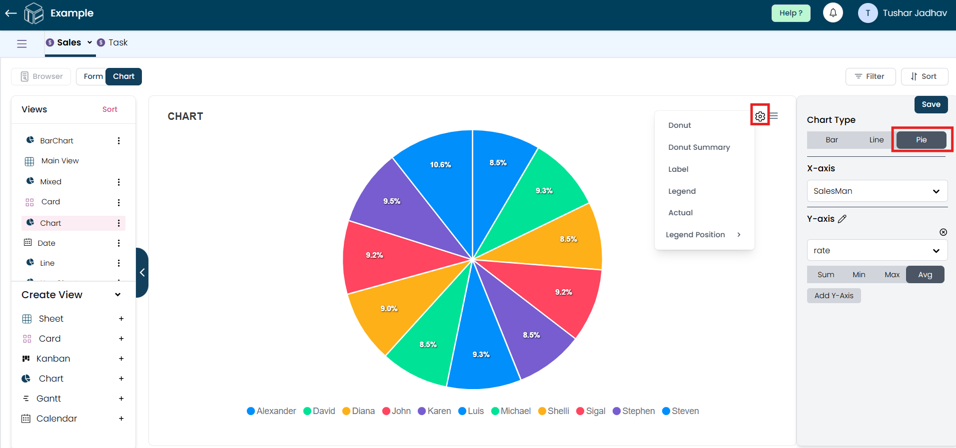
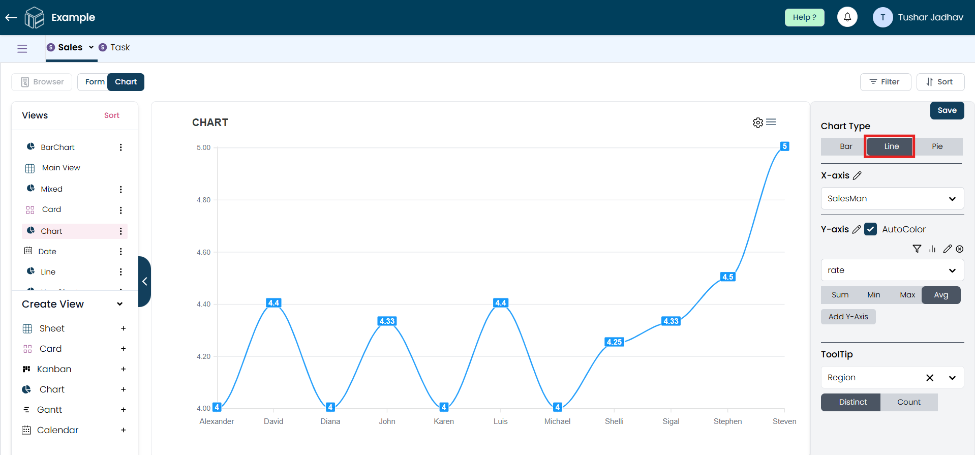
After selecting the "Chart" option, choose the chart type that best suits your data visualization needs. You can choose from various types, such as Bar Chart, Line Chart, Pie Chart, etc. Select the one that best represents the data you wish to analyze.
Step 4
Next, choose the field for both the x-axis and y-axis that you want to include in the chart. You can also add multiple y-axes for easier comparison of multiple fields, which helps identify trends or correlations.
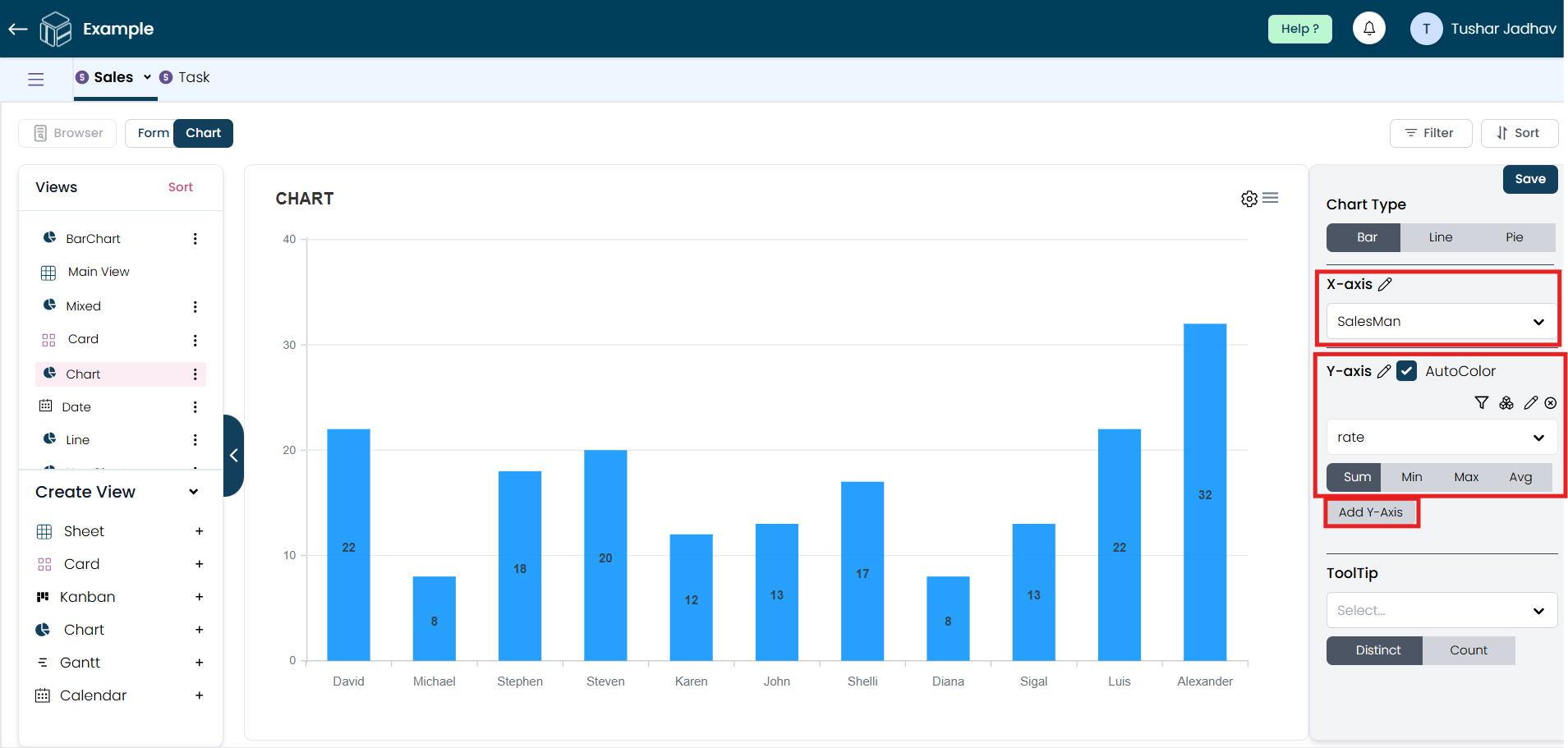
Step 5
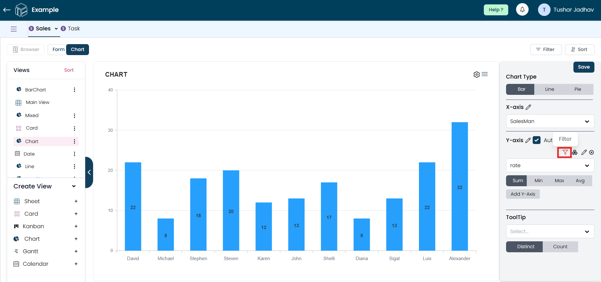
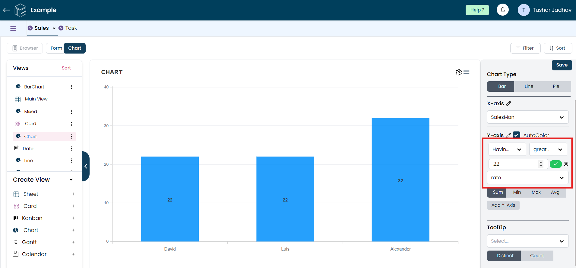
On the Y-axis, you can also add a filter to sort the data in the desired manner.
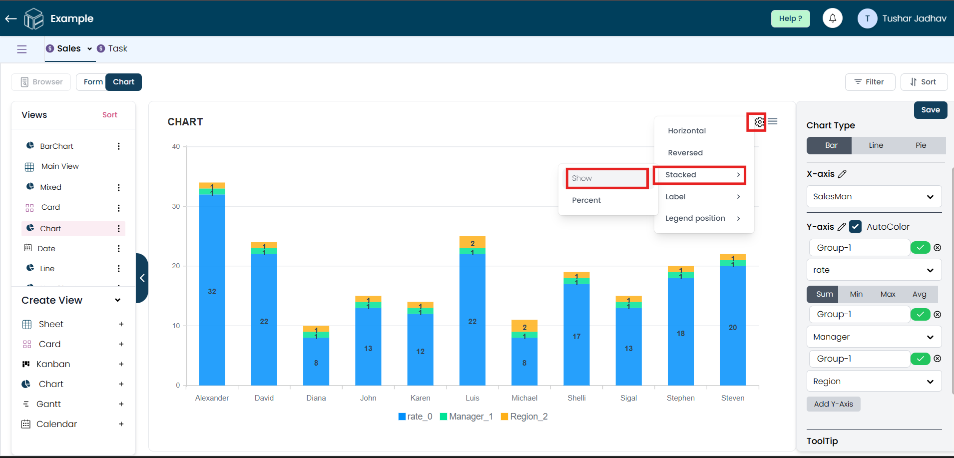
Step 6
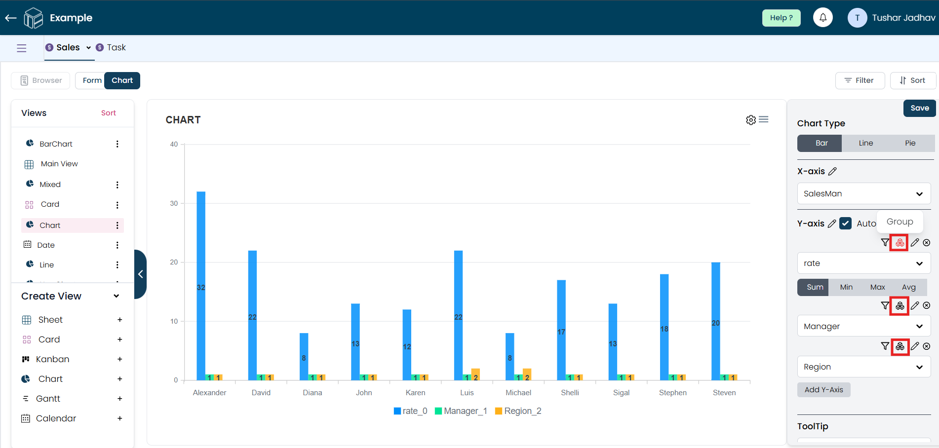
In the bar chart type, after adding multiple Y-axes to group the field data, you can assign group names to display the data in a single bar. To do this, click the 'Group' button and provide names according to your preference.
To view the changes, go to the settings, click on "Stacked," and then click "Show."
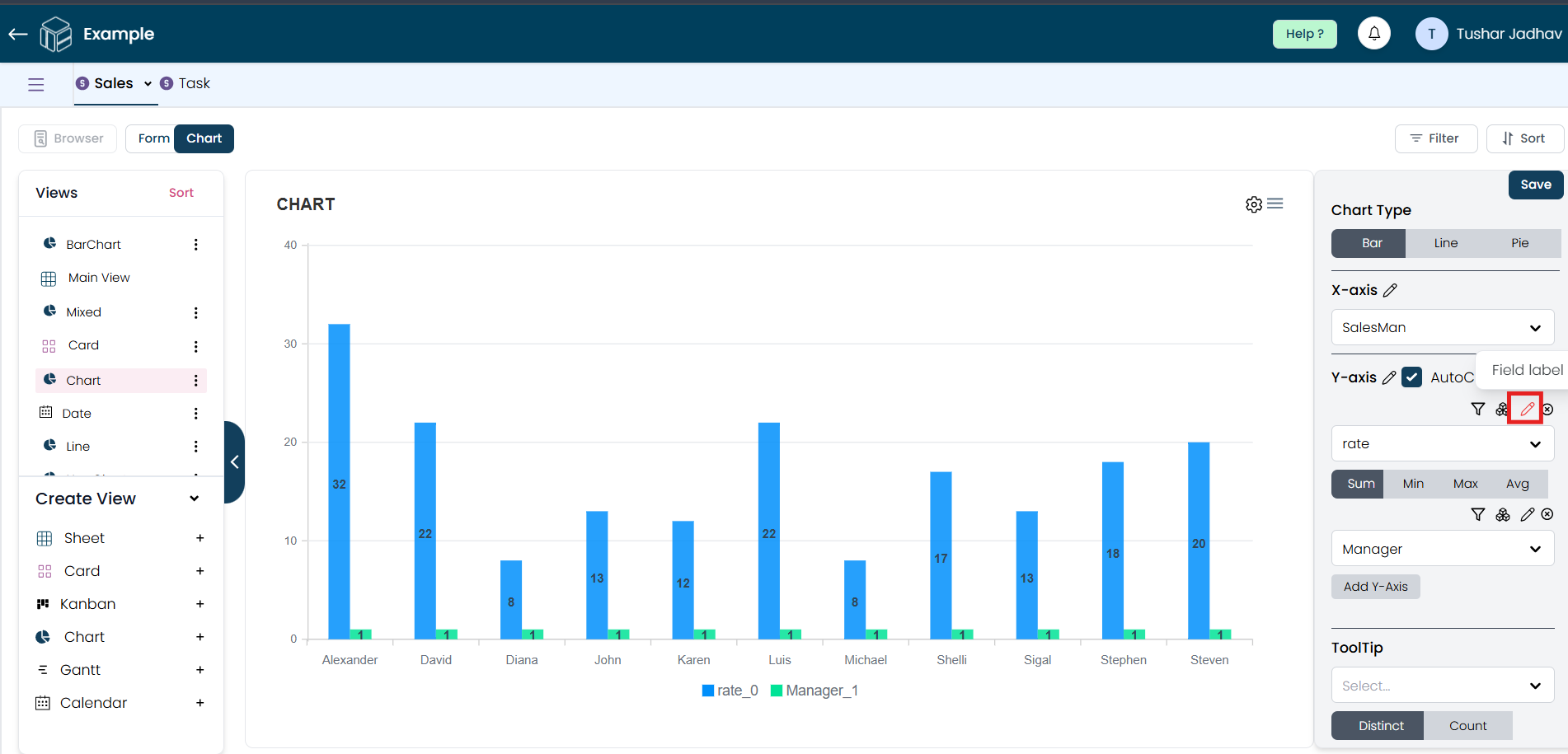
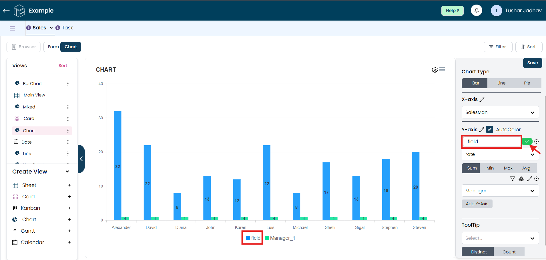
Step 7
By clicking the rename option, you can rename the field names. After renaming the field names, click the right button to save the changes.
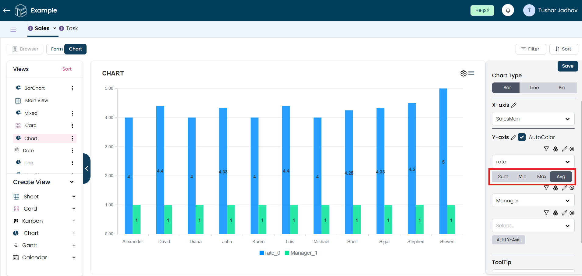
Step 8
For the Y-axis, you can optionally select an Aggregation Field if you'd like to summarize data points (such as sum, average, max, min, etc.). This is useful for displaying totals, averages, or other summarized data.
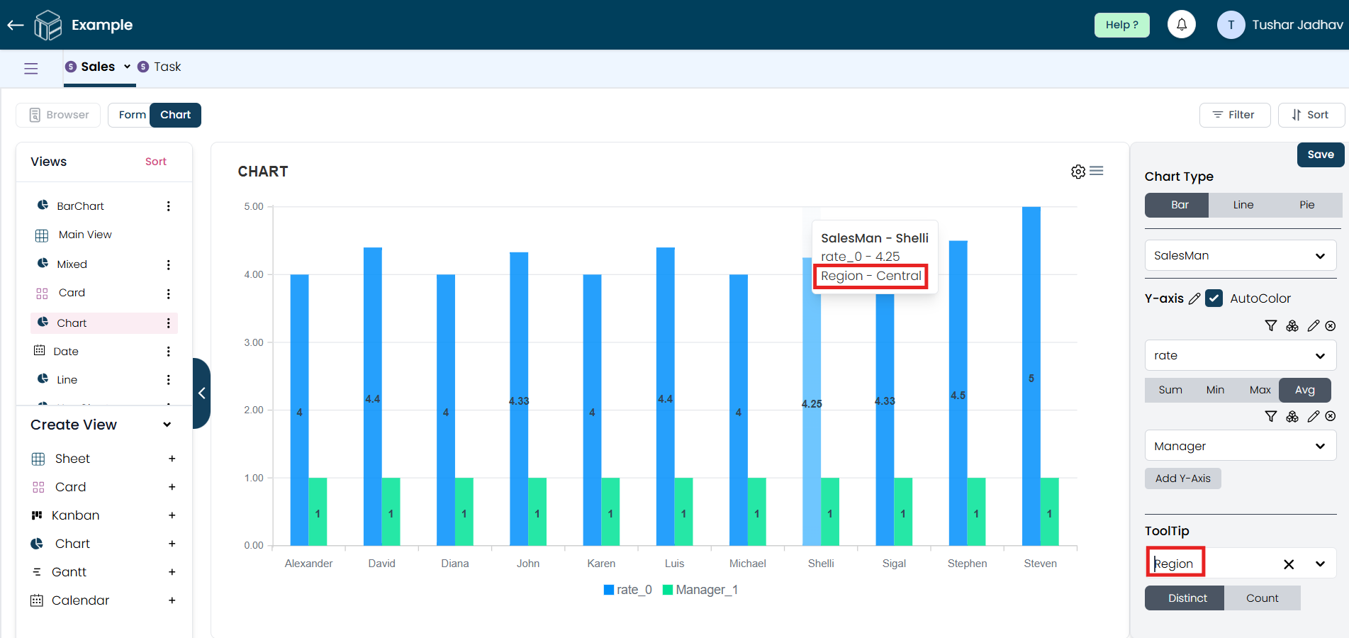
Step 9
You can also select a field for the tooltip. This allows data to appear when a user hovers over an item on the chart.
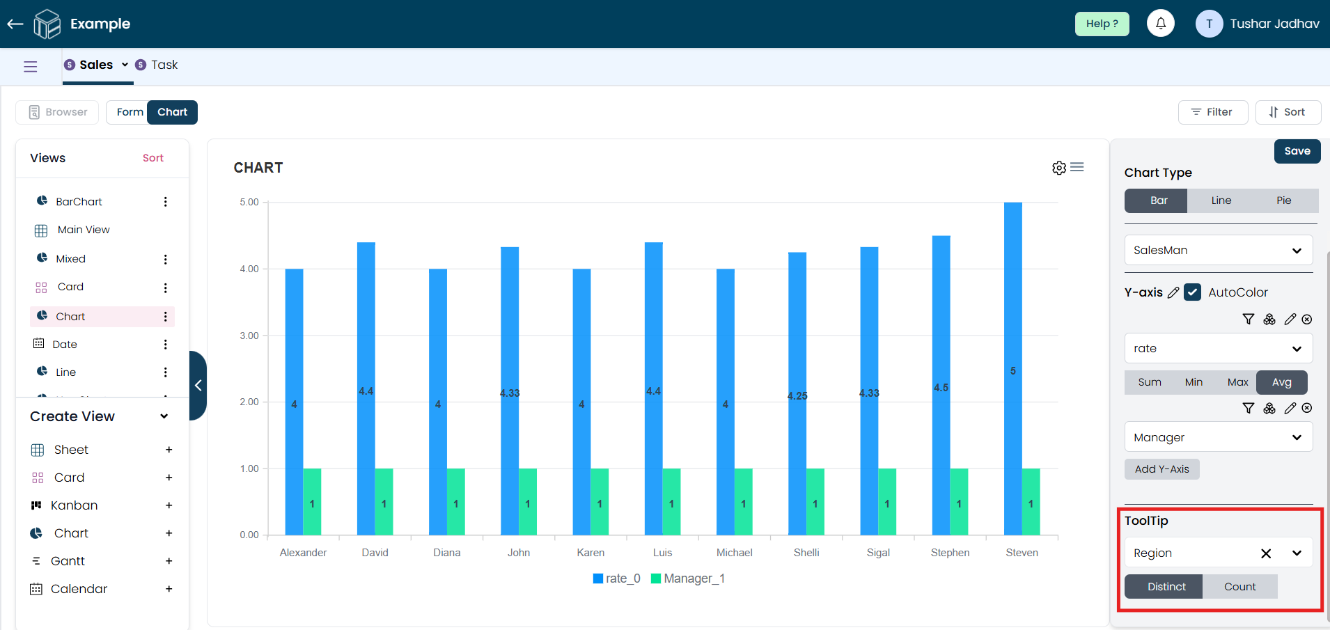
For example, if you choose "region" in the tooltip field, the tooltip will display data from the region field when hovering over a chart item.
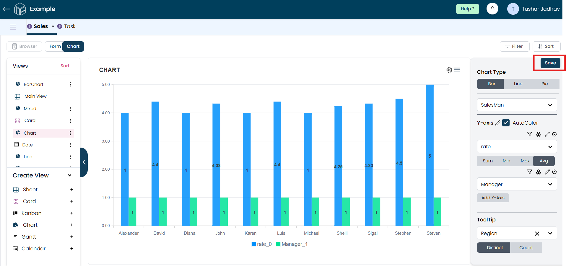
Step 10
Once your fields are configured and options are selected, click "Save" to generate your Chart view.
Step 11
After creating the Chart view, you can customize its appearance by clicking on the Settings icon. This will allow you to adjust chart colors, labels, legend position, and axis settings as needed.
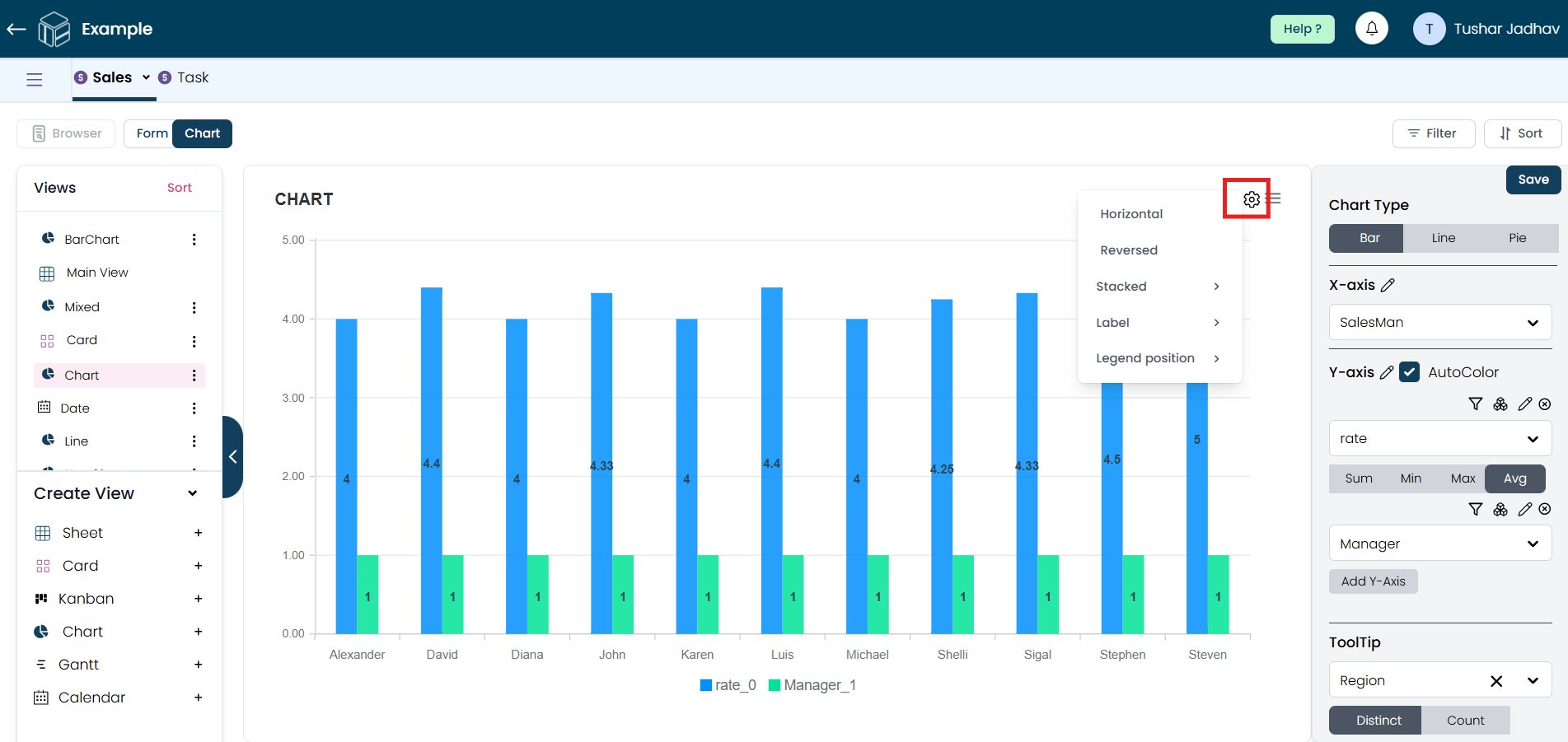 You can also switch between different chart types easily.
Step 12
Once all changes are made, click "Save" to finalize your Chart view.